 奇思妙想
奇思妙想
网页字体设计之该不该做
As so much of the content available on the web is text it’s essential for web designers to understand the basic principles of good typography. Having such knowledge allows designers to communicate more effectively, enabling them to create better designs and websites that are easier to use.
通常网页都会有很多文字,对于网页设计师来说,了解段落文字排版的基本原则是很必要的。掌握这些知识也有利于设计师更好的与客户沟通,以便设计出更好更易用的网站。
For more experienced designers setting text may come naturally but for those who are just starting out I’ve decided to put together a list of the basic do’s and don’ts. Not only will this list teach you the fundamentals but you can also use it as a check list to work through on future projects. Here goes:
对于经验丰富的设计师来说,排版段落文字是很自然的事情,但是对于那些经验欠缺的设计师,我觉得有必要列出一些基本的“该做”和“不该做”的。这不仅仅是一些基本的东西,你也可以以此作为检验你后面的那些项目的参考。
DO establish a typographic hierarchy
排版应该做到有层次
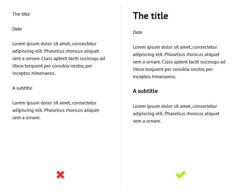
A typographic hierarchy can be established by using a variety of methods such as size, weight, color, and contrast. Its purpose is to give pages structure and guide the user through the content. Without a clear hierarchy the text becomes much harder to scan and therefore generally harder to read. Just take a look at the examples below. On the left the text is one size and one weight so it’s hard to differentiate between headings and body text. Meanwhile, on the right, we have the same content but with a clear typographic hierarchy, so it’s much easier to distinguish between the different elements.
要做到排版有层次感,可以有很多方法,比如字体大小,粗细,颜色以及对比度。做这些的目的是给页面一个层次构造以便通过内容引导用户。没有层次感的文本会让人难以浏览页面从而难以阅读。就像下面的例子,左侧的文本的字体都是一样的大小粗细,所以标题和正文都难以区别,与此对比,在右边,内容都是一样,但是排版很有层次感,很容易就区别它们是不同的元素。
Here I’ve only used size and weight to establish my hierarchy but for even better results you can try to experiment with color and contrast as well.
这个例子只是展示了利用字体不同的大小和粗细来设计层次感,而实际上你可以尝试使用颜色和对比可能会达到更好的效果。
DON’T make the text too small
文字不该太小
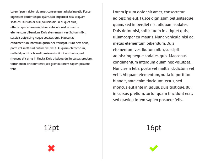
Not everybody has 20-20 vision so it’s important to make sure that your body text is big enough for people to read comfortably. Personally I would recommend no smaller than a size of 14pt.
不是每个人都有5.1,5.2的视力,所以请确保字体足够大以便读起来更舒服。我个人建议文字最好不要小于14pt.
DO choose an appropriate font for the body text
为正文选择合适的字体
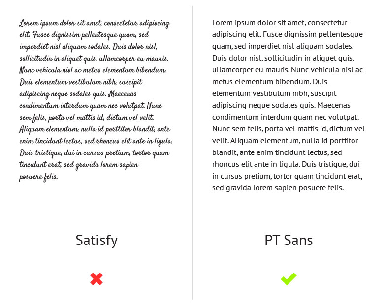
Another important factor when it comes to your body text is legibility. Although a typeface like Satisfy might suit a design with a hand-made aesthetic, using a typeface such as this for your body text will have a negative impact on your users. This is because it’s much harder to read than your average serif or sans-serif. Look at the examples below and you will notice how much harder your brain has to work in order to make out the words on the left compared to those on the right.
对于正文来说,另一个重要因素是易读性。虽然Satisfy这样具有手写效果的字体很带设计感,但是这样的字体用在正文中结果将是负面的。因为这字体相比serif或者sans-serif要难以阅读得多。看看下面的例子,你会注意到相比右边,你大脑要消化左边的文字是多么困难。
DON’T use too many different fonts on one page
同一页面不该出现多种字体
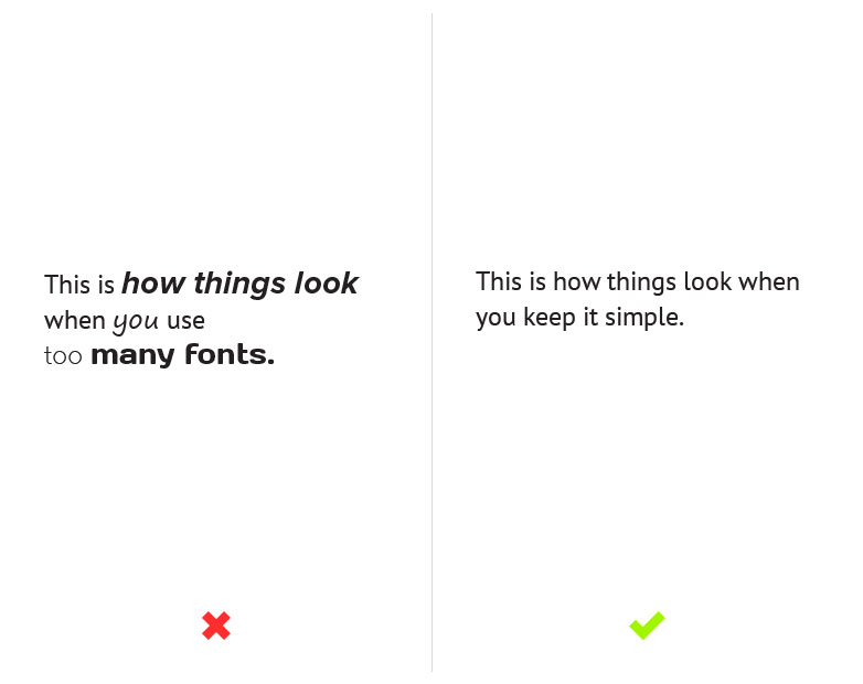
Services like Typekit and Google Fonts may give you access to thousands of fonts but it doesn’t mean that you have to use them all. As you can see from the example below, unless it’s done really well, using multiple fonts can be very distracting. This is why I usually recommend using no more than 2 or 3.
像Typekit 和Google Fonts这样的服务有成千上万的字体供你使用,但这不意味着你都需要它们。正如下面的例子,除非搭配效果很好,否则不同字体带来的只能是十分凌乱。我通常建议一个页面不能多于2到3种字体。
DO give your text room to breathe
给你的文字留些呼吸空间
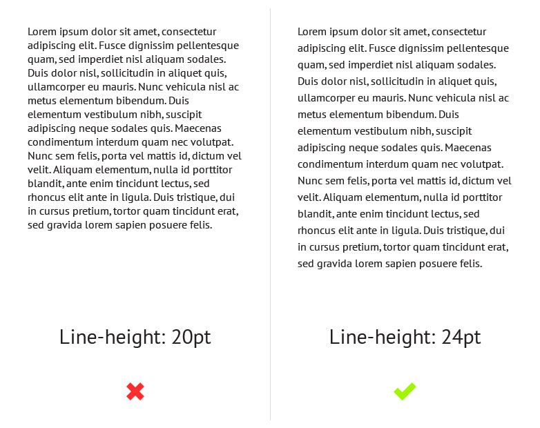
A lack of white space between each line can affect readability because it makes it difficult for the eye to track from one line to the next. However, this problem can easily be solved by increasing your line-heights, but be careful not to overdo it, too much space can also affect readability in a negative way.
行与行之间缺乏间距会影响可读性,因为人的眼球很难在文本中追逐这一行。不过这个问题很容易解决,增加行距即可以解决,但是也要小心别做过头了,太大的行距对易读性也有伤害。
DON’T make continuous use of all caps
不要全部大写
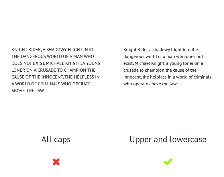
People aren’t used to reading large chunks of text set in all caps and because of this it’s actually harder for people to read. Not only that but people often associate all caps with shouting or aggression and when it comes to marketing copy it can come across quite spammy. Due to this it’s important to think about how and when you’re going to use all caps and to make sure that you use it in moderation.
人们不习惯阅读一大段全部大写的文字,因为这样的确比较难读。不仅如此,人们通常还会把全部大写不自觉的联想到吵闹和侵犯,如果是在销售文案中则会变得像垃圾信息。鉴于这些,什么时候使用全大写需要仔细斟酌,确保做到适度。
DO try and limit paragraphs to 40-60 characters per line
段落文字每行限制在40-60词
If a line is too long the reader gradually begins to lose focus and can often have trouble reading from one line to the next. If a line is too short it causes the reader’s eye to travel back too often, which disrupts their rhythm. This can also make them start reading the next line too soon, causing them to miss words from the previous line. This is why the optimal line length for body text is said to be around 40-60 characters per line.
如果一行文字太长,读者容易失去注意力,行之间的衔接阅读也容易出现问题。如果字行太短,则眼睛来回切换过于频繁,容易打乱节奏,还可能导致跳行阅读,忽略上一行的字词。这就是为什么说每行最佳长度是40-60词的原因。

DON’T use large amounts of centered text
不要使用大量文本居中
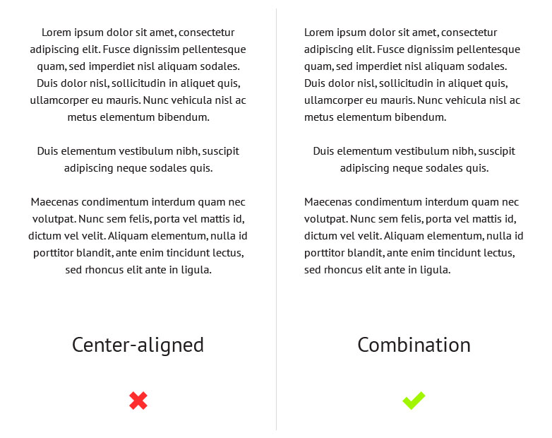
Centered text is difficult to read because the edges of the text block are uneven which makes it harder to scan because each line has a different starting point. Centered text blocks are also difficult to align to other objects on the page and are often considered to look quite amateurish. This is why, like all caps, it’s best to use centered text in moderation, opting for left aligned text as standard instead.
段落文字居中很难阅读,因为这些字块的边沿不均匀导致每行的起始不一致从而难读。居中的文字也很难跟页面其他元素对齐,从而显得很业余。所以,居中文字就像全部大写一样——适可而止,左对齐是较正规的选择。
DO make sure there is enough contrast between your text and the background
文本与背景要有足够的对比度
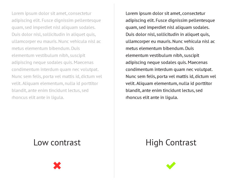
Contrast is another aspect of typography that can affect readability. If there’s not enough contrast between the text and the background, the content can become illegible.
对比度是影响文本可读性的另一个因素。文字和背景没有足够的对比度,内容就变得模糊不清。
Another post on the topic: 阳痿药物治疗
译自:http://www.webdesignerdepot.com/2013/05/dos-and-donts-of-typography/


